Featured

Featured

12 Logo Color Combinations to Inspire Your Design

When you think about the logos of major brands, you probably just take the colors they use as a given. Of COURSE the Youtube play button is red and white and McDonald’s arches are a happy yellow – it just makes sense.

That’s because color psychology plays a monumental role in branding; colors influence our perception and make us feel a certain way, even if we don’t always realize it on a conscious level.

Still, it may not seem like much thought went into the logo color combinations mentioned above – aren’t they just the logical choice for what those particular brands do?

Not so fast. You can bet that a hundred cups of coffee and millions of dollars went into the original logo designs of some of these powerful brands – with much of the focus likely having been on the color combinations.

So what does this mean for your own logo?

Your logo’s personality is rooted in its colors – are you a bold seagreen-fuschia, or maybe a soft yellow-white? By learning your way around color combinations, you can create a logo that tells your audience exactly who you are.

On that note:

What are the Best Color Combinations?

First rule of thumb: Don’t overdo it – less is more.

With logo color combinations, it’s better to limit your creative explorations than go color-crazy. In this vein, we recommend sticking with two- or three- color combinations – or, of course, a single logo color.

Let’s start with the basics:

Two-Color Combinations

Two-color logos are an industry standard. They often use contrasting shades, which creates an eye-catching effect.

Here are some of our favorite two-color combinations.

1. Yellow and Blue: Playful and Authoritative

Yellow is the ultimate attention-grabber, and it sets up a youthful backdrop for the authoritative navy. This logo’s color combination is playful yet confident, giving the impression that the company behind the symbol is one to be trusted.

2. Navy and Teal: Soothing or Striking

This berry-teal color combo can have two different effects, depending on how it’s used. Put teal on a berry background for your logo to pop; lay the darker blue over the teal to comfort and calm.

3. Black and Orange: Lively and Powerful

Enthusiastic orange interacts nicely with powerful black, creating an overall feeling of mystery and thrill. This logo color combination is particularly well-suited for activities that promise an adrenaline rush, like extreme sports, escape rooms or nightclubs.

4. Maroon and Peach: Elegant and Tranquil

This unique pair of plum and peach is not often seen together, but it adds an element of charm to any logo! You may want to think about using this color combination if your brand is in the fashion industry, home decor, or alternative medicine.

5. Deep Purple and Blue: Serene and Dependable

Nothing says reliable like a combination of light-blue and mulberry purple (bordering on brown). Consider using this pair to brand for cosmetics or high-end retail.

6. Navy and Orange: Entertaining yet Credible

Opposites attract – and so do these complementary colors! The security of blue grounds the impulsive sides of orange, invoking a simultaneous feeling of excitement and trust. Always ready to entertain, this navy-and-rust pair promises a good time.

Three-Color Logo Combinations

These logo color combinations can be a little harder to pin down, because the options are many but not all choices are good ones.

In general, two contrasting colors with one complimentary color can be the way to go – but there are exceptions to that rule, too!

To give you a feel of what does and doesn’t work, here are a few of our favorite three-color combinations:

7. Beige, Brown, Dark Brown: Warm and Reliable

The smell of coffee is practically radiating off of this logo. Browns ooze dependability, while a cream background keeps the logo from feeling dull. This could be a solid color combination to use if you’re in the food industry or want to be perceived as family-friendly.

8. Blue, Yellow, Green: Youthful and Wise

This one takes two primary colors and throws their secondary into the mix – a perfect match! The butter-yellow majority with a touch of lime keeps the logo playful and youthful, while the azure lettering brings an heir of wisdom to the table.

9. Dark Blue, Turquoise, Beige: Confident and Creative

Keeping it in the family! These two blues complement each other and reaffirm the trustworthiness of the brand. Combine them with the beige backdrop, and you get the reassurance that it’s safe to explore and pursue. This logo color combination is great for brands in the travel niche, life coaching, and healthcare.

10. Blue, Red, Yellow: Funky and Radiant

Contrast meets contrast meets contrast in this triadic, three-color combination. Various shades of each primary color merge into a logo that pops off the page and leaves funk it its wake.

11. Light Pink, Hot Pink, Maroon: Friendly and Innocent

If you were looking for a logo that screams “approachable,” the pink color family is your best bet. These shades are different enough to add some aesthetic flare to the logo, while sufficiently similar to maintain the look of innocence. Throw maroon into the mix, and you mitigate the risk of exhibiting naivete – giving off just the right amount of professionalism.

12. Navy, Yellow, Beige: Professional and Optimistic

Have you been able to tell that we love blue yet? It’s not for nothing – blue is the most used color in logos of the top 100 brands worldwide (see IKEA, AT&T, Walmart, and NASA for reference).

Here, the wheat-beige acts as a subtle bridge between the two primary colors, reducing the seriousness of blue and accenting the lively side of yellow to create a balanced, professional feel.

Over to You

Colors are an important aspect of your brand’s identity. After choosing the type of logo you want to use, you should take some time to consider what each color will say about your company.

Think about the emotions you are trying to elicit, and how you want your consumers to respond to your brand. By choosing the right color combination, you can help your brand leave a lasting impact that shapes a more powerful connection with your audience.

Featured

Featured

Psychology in Design. Principles Helping to Understand Users.

Some people are used to thinking of design as a purely artistic job but there is much more standing behind it. The sense of beauty and inspiration are not enough to create the proficient design. That’s why designers should possess certain knowledge and skills of distinct sciences to do their job right. And it’s not only the art of design, it’s also about various fields of knowledge and practice which help them work efficiently and productively. One of the basic studies helping designers to understand users is psychology. Today, we will figure out what a big part psychology plays in design and what psychological principles are essential to remember during the design process.

The role of psychology in design

Today the tendency of user-centered design makes designers reconsider approach to their work and go deeper into the understanding of the target audience. Donald A. Norman in his book “The Design of Everyday Things” defines design as an act of communication, which means having the deep understanding of the person with whom the designer is communicating. In order to get better insight into people’s needs, designers are recommended to bear in mind the psychological principles of human behavior, aspirations and motivations.
The outcome of the work can be even more positive if a designer applies psychology in the creative process since the science gives the close understanding of the target audience. Psychology knowledge helps to create the design which will make users perform the actions they are expected to such as making a purchase or contacting the team.
Designers may see psychology as a complicated approach to improving the design and for that reason neglect this part of research and analysis. However, you don’t need to be a Ph.D. in psychology to use it at your work effectively. All you need to consider are the basic principles constantly presented in design. Based on our experience and the conducted research, we’ve defined six effective psychological principles often applied in the design process.

Gestalt Principles

This psychological theory is almost 100-year-old but it hasn’t lost its actuality. The word “gestalt” means «unified whole» so the theory explores users’ visual perception of elements in relation to each other. In other words, it shows how people tend to unify the visual elements into groups. The principles, on which users form the groups, include:

Similarity. If a user sees objects that look somehow similar, they may automatically perceive them as the individual elements of one group. The similarity between elements is usually defined with shape, color, size, texture or value. The similarity gives users the sense of coherence between the design elements.

Continuation. It is the principle according to which the human eye moves naturally from one object to the other. This often happens through the creation of curved lines allowing the eye to flow with the line.

Closure. It is a technique based on the human eye’s tendency to see closed shapes. Closure works where an object is incomplete but the user perceives it as a full shape by filling in the missing parts.

Proximity. When objects are placed in close proximity, the eye perceives them as a group rather than seen individually even if they aren’t similar.

Figure/Ground. This principle demonstrates the eye’s tendency to separate objects from their background. There are lots of examples of pictures that shows two faces depending on where your eye is focused the object or background.

The Gestalt principles confirm in practice that our brain tends to make tricks with us, so designers should consider that fact during the creation process to exclude the possibility of misunderstandings.

Visceral Reactions

Have you ever had that feeling when you fall in love with the website after the first second when you’ve opened it? Or maybe an application has made you sick only with the quick glance at it? If yes, then you’ve already known what’s a visceral reaction. This kind of reactions comes from the part of our head called “old brain” responsible for the instincts and it reacts much faster than our consciousness does. Visceral reactions are rooted in our DNA, so they can be easily predicted.

How do designers use this knowledge? They aim at creating a positive aesthetic impression with the design. It’s not that difficult to guess what looks nice to people and what doesn’t if you know your target audience and their needs. So, the tendency of using the high-resolution beautiful photos or the colorful pictures at landing pages, websites or any other web and mobile products is not accidental.

Psychology of Colors

A science studying the influence of colors on the human’s mind, behavior, and reactions is called the psychology of colors. Today we won’t go deep into the aspects of this study since it is complex so deserves to have a specialized post devoted to it (on which, besides, we’re already working). In a few words, the main idea of the study is that the colors have a great impact on the users’ perception. That’s why designers should choose the colors knowingly to make sure their work presents the right message and tune.

Here is the list of the basic colors and the meanings which they are typically associated with:

Red. The color usually associates with passionate, strong, or aggressive feelings. It symbolizes both good and bad feelings including love, confidence, passion and anger.

Orange. An energetic and warm color bringing the feelings of excitement.

Yellow. This is the color of happiness. It symbolizes the sunlight, joy and warmth.

Green. The color of nature. It brings calming and renewing feelings. Also, may signify inexperience.

Blue. It often represents some corporate images. It usually shows calm feelings but as a cool color it also associates with distance and sadness.

Purple. Long associated with royalty and wealth since many kings wore purple clothes. It’s also a color of a mystery and magic.

Black. The color has a great number of the meanings. It associates with a tragedy and death. It signifies a mystery. It can be traditional and modern. Everything depends on how you employ it and which colors go with it.

White. The color means purity and innocence, as well as wholeness and clarity.

Recognition Patterns

You may have noticed that website or applications united with one theme usually have common patterns in their design. The reason is the users’ psychology. The thing is that people visiting a website or using an application are expecting to see certain things associated with the definite kind of product.

For example, visiting a website of a barbershop, the users are not expecting to see bright colors or pictures with cats or anything like this because if they do see it, this will definitely make them think of a website as an untrustworthy resource.

However, not only the colors and pictures matter. Some obvious and common things such as a list of blog posts on the front page of a blog or the filters in the e-commerce website are also important for successful navigation. Users become accustomed to things quickly and their absence makes them feel uncomfortable.

Scanning Patterns

In our article Tips on Applying Copy Content in User Interfaces, we’ve already mentioned that before reading a web page, people scan it to get a sense of whether they are interested. According to different studies, including the publications by Nielsen Norman Group, UXPin team and others, there are several popular scanning patterns for web pages, among which “F” and “Z” patterns.

F-pattern is referred to as the most common eye-scanning pattern, especially for web pages with the big amount of content. A user first scans a horizontal line on the top of the screen, then moves down the page a bit and reads along the horizontal line which usually covers a shorter area. And the last one is a vertical line down on the left side of the copy where they look for keywords in the initial sentences of the paragraphs. It usually occurs on text-heavy pages like blogs, news platforms, thematic editorials etc.

Z-pattern is applied to pages which are not so heavily concentrated on the copy. A user first scans across the top of the page starting from the top left corner, looking for important information, and then goes down to the opposite corner at a diagonal, finishing with the horizontal line at the bottom of the page, again from left to right. This is a typical model of scanning for landing pages or websites not loaded with copy and not requiring scrolling down the page, which means that all the core data is visible in the pre-scroll area.

Knowing these patterns, designers can place the elements in an effective way for users’ perception and help them perform expected actions.

Hick’s Law

The law states that the more options users are exposed to, the longer it takes them to make a decision. This means that the more options you give to users, be it products to choose or pictures to look at, the more time and energy it takes to make a decision about the next step of interaction. The possible result here is that the users make the choices but get unpleasant feelings after using the product, or in the worst case, they may not want to take such a significant effort and just leave.

That’s why designers are recommended to keep any options including buttons, pictures, pages to a minimum. Removing unnecessary choices, you make the usability of the product more effective.

Psychology is an effective tool in design which makes the creative process more productive while the result is going to be more user-centered. We’ve told you about six useful principles but they are only the tip of the iceberg because there is much more to learn on the topic. Don’t miss our next blog posts continuing this useful theme!

Featured

Featured

10 Psychology Concepts for Designers

Once designers were just asked to make something beautiful, but this is happily — mostly — no longer the case. The value of design is understood throughout the tech industry and it’s not because we make things look nice. It’s because designers understand the impact of psychology can have on product design, and use those techniques to make products intuitive, coherent and sometimes even addictive.

Why Learn Psychology?

Psychology is a science. Having a basic understanding of psychology will not only let you know what people do, but also why people do it. While certain parts of UI design can be subjective — we all have a preferred colour or font — psychology cannot be disputed.

As a designer, there are a few ways to really get better:

  1. Know The Tools
  2. Improve Soft Skills
  3. Understand Human Psychology

After learning Photoshop or Sketch, the next thing you can do to make sure your products are delightful and easy to use is to know psychology. There are a few key reasons why knowing about psychology will improve your design process.

Inform Your Decisions

An experienced designer can defend their decisions confidently. The key to being able to defend your decisions is to know why you made them, and why they make sense. It can’t always just be ‘because it looks good’ — there should be a bigger reason. Today, we are going to look at 10 psychology concepts that can be translated into design.

We are designing for people, so having knowledge of human psychology is essential in design. By the end of this article, hopefully you’ll understand not only what works, but why it works.

Using Psychology Concepts to Improve Design

Get to know human behavior. Understand what makes users tick, what makes them feel frustrated, and what makes them feel at ease. I’ve rounded up 10 psychology concepts that you can use in your designs starting right now. If you’re interested in knowing more about this subject, I’ve also included a few book recommendations at the bottom of this article.

1. Visual Cues

Ever walked up to a door and tried to pull it, when you were supposed to push it? And then feel like a bit of an idiot? Me neither. But if that had happened, it would be because you were given a misleading cue about what to do. The door had a handle that made you want to push it even though the sign said “pull”.

Have you ever taken something new out of the box, and without reading the instructions, know how to use it? Things like new phones, remote controls or appliances have physical switches and buttons that let you know how to switch it on, how to access the menu — these are affordances. In the case of a remote control or the buttons on a stereo, there might also be be iconography (think of the play, pause and next icons). You know instantly how to operate most remote controls based on the iconography.

How To Use This In Design

Your goal as a designer is to make an app or website usable by clearly communicating functionality to the user. If something is actionable, make sure this is highlighted in a consistent way that also follows conventions.
Use visual affordances when you want a user to click something. Use clear icons when there is a control you want them to use.

2. Gestalt Principles

The Gestalt Principles, otherwise known as the laws of Proximity, Similarity, Symmetry and Closure. Humans are programmed to make connections with things that are visually similar or are closely grouped together.

How To Use This In Design

Group controls in close proximity to the content that they will affect. If you are designing a flight booking form, place the cities, dates and number of people in the same place, rather than having them scattered all over the screen. If you are designing a checkout, group the cost and the delivery information together. Think logically about sectioning off different pieces of content.

3. People Have Limited Short Term Memory

We can only hold so much information at any one time. This is also represented as one of Jakob Nielsen’s Usability Heuristics, “recognition rather than recall”. Eliminate the need for people to remember information if possible by making relevant information visible or readily available.

How To Use This In Design

If a user has carried out a search, show the search term along with the results. If they have filtered something, show the items that have been filtered. If they have entered incorrect information, show them which field was incorrect and why. Users should not have to remember the previous state if it affects the present state. Inform them if their previous decisions affect their current state. This way, if they feel their current state is incorrect, they know what information to change.

4. People Have a Limited Scope of Awareness

So I’m sure you’re aware of the Awareness Test?

The Awareness Test is a useful way to show us that we are only able to focus on particular things at a particular time, whether we are aware of it or not. It is also worth knowing that the average attention span of a human is only about 10 minutes long. After that, we start to wander.

How To Use This In Design

People will pay very close attention to what you ask them to, and ignore everything else. Our brains are wired to selectively focus on specific things. Many shopping sites keep the cart information at the top corner of the screen, while the “add to cart” button is in the center. When a user adds something to their cart, you could make the user aware that a change has occurred in the top corner also, either by making an exaggerated visual change or animate the cart in some way. Don’t assume that while everything is visible, the user can see everything. Very often, they are focusing on something else.

5. People Learn From Examples

I don’t mean that you have to create a tutorial video for every new feature, but this is useful information particularly when it comes to designing forms.

How To Use This In Design

I’ve used this particular psychology concept with great effect in forms. By designing my forms to have a label, and using a placeholder with an example instead of a blank field, I’ve given the user 2 visual cues as to what content is expected. This is a great way to cover all your bases, particularly if the label font size is small (which sometimes it can be).

This is also particularly useful for telephone numbers. Show the user the format of the phone number, including the area codes that are needed etc. It’s very frustrating for users when their phone number isn’t accepted by a registration form simply because the designer hasn’t made it clear what information the system needs.

6. People Are Motivated By Other People’s Choices

It’s called Social Proof. It means that users can be encouraged to do something knowing that others have also followed this path.

How To Use This In Design

If you’re working with an ecommerce app or site, it can be a powerful thing to have a “Favourites” or “Top Items” section. Another idea is if you had a “Customers Also Bought…”. Another way is to include a reviews feature, or allowing people to filter by “most popular products”.

7. People Are Motivated By What Remains To Be Done

In research carried out by Minjung Koo and Ayelet Fishbach in 2010 found that people are more likely to be motivated to finish a task if they see what remains to be done, rather than what they have done.

How To Use This In Design

It’s possible to use this concept in something like a checkout or an on-boarding process. When a user signs up for a service, say “Almost Done, Just Verify Your Email” to make the task feel like they are almost complete. Similarly, for a checkout, using a step-by-step process to show how many steps are left will motivate them to finishing the checkout.

8. People are Overwhelmed by Too Much Choice

I came across this one in a book about sales called The Paradox of Choice: Why More Is Less, and I’ve written about how too much choice can kill conversions before. Users are more likely to feel overwhelmed when they have too much choice in front of them. Users will be more satisfied with their decisions if they have less options.

How To Use This In Design

This technique is very effective in pricing pages. Of course, that sort of decision would normally be up to the CEO, but having too many options will actually kill your conversions.

The other place that this is useful is with filters and sorting. I’ve worked on websites that have over 100 filter options for a single page, and our analytics showed customers did not use it. Reducing this number to a measured and managed number of possible options would infinitely improve the customer journey.

9. People are Overwhelmed by Too Much Information

Overwhelming a user with lots of large text and too many buttons is chaos for their cognitive load. Your goal as a designer is to guide the user to making the decision they want to make. The elements on the screen should have a coherence and balance about them. While it can be tempting to create lots of bright flashy price information to try to get their attention, from a psychology stand point this will have a negative impact on the users ability to make a choice they are happy with.

How To Use This In Design

Organise your content into a visual hierarchy to make things easy to scan for the user. Use the law of proximity to group like with like, and have a coherent structure of headings, images and buttons to guide the user through the process naturally.

10. Variable Awards Are Addictive

Maybe more for the product development side of things, but still something worth knowing. As explained in the book Hooked by Nir Eyal, using a random awards is what really makes things addictive. Think about the last time you check your Instagram, Twitter or Facebook. Why did you do it? To see how many likes your last post got. This is the power of using unpredictable awards in your app or website.

The power of Variable Awards has also been used in gaming. If you’ve ever played Candy Crush, coming back each day to see what daily rewards you win is a reason to check in.

Variable Awards is also what makes gambling addictive.

How To Use This In Design

This depends a lot on the goals of your project. If you would like people to use your product every day, you could give the user a chance to win a different prize every day (like in Candy Crush).

Featured

Color Theory: Why Does It Matter?

How are colors used in art? Why is color diversity relevant? What are color theories? What is the importance of color theory? We have all the answers!

Color Perception Affects First Impression


What the artist does first is choose the color. Choosing the right color to express your feelings and emotions is very important. 


In color theory, colors are organized on a color wheel and grouped into three categories. The artist then chooses primary colors, secondary colors, and tertiary colors from a color wheel.


Of course, it’s all a matter of perception and our senses. For some, blue is a reflection of sadness and loneliness. For others, it stands for freedom because the sky has no limits. Red as the color of love will represent jealousy or blood to many artists.


Colors contribute to giving the best first impression in business, life, etc. Blue is one of the most popular background colors for presentation slides. Despite representing loneliness to some people, it is calming and conservative, so its usage in business is popular.


Red is the warning color. Purple is mystical. Yellow is one of the most attention-grabbing colors. If we exclude the fact that red is the warning color, red is also one of the colors that attract attention and is used for other things.


Remember what colors the team of designers and marketing experts at McDonald’s used. Red, yellow, and blue, right?

These Are Pre-Existing Fundamentals and Rules


It takes 90 seconds for an individual to see whether they like the product or not, and the colors on the products are 90% of the decision. So if you’re serious about your job, you can’t just throw color on color.


Respect fundamentals and rules. You are not allowed to change or skip them. Art theories already exist. Whether you are a theorist or an applied artist, follow them. Whatever art you do, you have to respect the rules.


Let’s think a little about digital art, for example. People see colors in light waves. As we mix the base colors — red, green, and blue — and add light, the color becomes lighter. When we mix all colors, we get the color white.


As in fine art, screens use primary colors. But on screens, these colors are red, green and blue. If we don’t use the correct color process, the image or logo we share anywhere will look muddy. Don’t skip rules!

Your Outputs Are Your Visual Signature


Whether you are a freelance artist or a designer, you should have a style. Also, if you skip educating yourself on art theory at the very beginning, you risk staying uneducated on the topic forever.


The sooner you learn, the more chances are that you will figure out the basics and learn how to experiment fast. You see, when you do graphic design, you can create a masterpiece that brings sales, along with good marketing. And you know what else is responsible for good marketing? Colors, of course.


The importance of colors for design has to be pretty clear by now. While we follow basic rules of color theories and tailor our visual signatures to them, we are on the right path. Color theory is important for success in design, marketing, and developing an individual as a successful designer.


So we are allowed to walk inside the color wheel, which has a variety of opportunities to try. It seems as if a color wheel has never-ending abilities. And it makes it a bit difficult for an artist or designer to find a style of their own.

Powerful Tool for Artists 


Color theory is a set of principles that contains guidelines for artists in the act of artistic expression. Color theory is a powerful tool. Some combinations are acceptable, and others are not. And that’s where we draw a line.


We have already mentioned that artists need to respect the rules. A good artist does not cross the border between the beautiful and the grotesque. 


Yes, rules sometimes sound boring, but they are necessary. Academic painters, visual artists, and everyone else who understands the basics will recognize whether a work has an artistic value or not by observing it.

If you are doing digital arts (such as graphic design and web design), color theory is beyond important. Knowledge of color theory guides you in your marketing, and it can also help you better understand what your competition is doing.


There are three types of colors, primary (red, blue, yellow), secondary (mixes of primary colors), and tertiary (or intermediate — mixes of primary and secondary colors) colors. Get to know the color theory better, and from there, you can expand your understanding by using it in your work.

Better Understanding of Visual Communication 

Visual communication is a way of conveying ideas and information in many forms. So, visual communication is the way artists communicate through their works. And it goes back to ancient times.


People have always used images to communicate. Do you remember the Egyptian hieroglyphics? Words, as well as shapes, can be an effective complement. However, the primary ideas in visual arts are drawings, paintings, sculptures, and many other art objects.


How do artists address the audience? What are they telling them? What are the popular topics? Many use art to express their opinion on a current topic and in response to specific questions. They interfere in politics with a secret message that is dedicated only to certain people. To people who understand.


Often the artist will communicate with his audience through a clear image. He may use a picture of a state leader with some added elements to send a clear message and his opinion about the leadership and current status in the country.


Sometimes he will communicate with their followers through hidden messages that nobody can spot immediately. And he will know that only his like-minded people will notice the messages.


They communicate through elements we may not notice at the very beginning. They communicate through the choice of colors and compositions.

Featured

The Ultimate Article About Mens Beaded Bracelets You’ll Ever Read

Bead weaving is a popular form of needlework. Occupation is fascinating and does not require large material costs. Many girls create bracelets not only for themselves, but also for sale. Beadwork is a laborious craft, it requires attention and perseverance. But creative men’s beaded bracelets made by hand will always be noticed by others.

Beads and weaving principles

For a start, let’s figure out what the beads are? Beads are small beads slightly flattened at the hole. The diameter is different, but mostly up to 5 mm. Beads can be elongated, such a material is called glass bead. Bugle varying in diameter, found up to 9 mm. Color, shade, the surface of the beads and glass beads are diverse. From these signs depends on the future appearance of the bracelet.

Beadwork

The material looks simple and inconspicuous, but you can make amazingly beautiful jewelry from it. Often beads are used to create embroidery, panel. Skillful needlewomen create volumetric toys from it. Trees and flowers made of beads look very elegant. But the main direction in the weaving of beads is the creation of jewelry.

Many novice craftswomen are concerned about the question of how to weave a bead bracelet? Practice shows that weaving a bracelet does not differ in increased complexity. Seeing at least once made a bracelet with your own hands, you probably want to create one.

Useful tips

To get started, you need to choose a material. As a rule, there are no restrictions on the choice of beads. For future decoration, you can give preference to both small material and large. If you like beads of irregular shape, you can safely make weaving out of it. The final choice is only for the masters. For weaving a bracelet, not only beads are used, but also bugles, chopping. These are decorative elements that represent various sticks.

Experienced needlewomen prefer to make products from large beads. Often they use sequins and cabochons in jewelry. A cabochon is a semi-precious and precious stone that has been specially treated.

For a unique collection of beaded bracelets for your Valentine, including leather and wrap bracelets visit braceletworld.co

Choosing a Bracelet for making

The final version of the shape of the bracelet everyone chooses. The lighter option is a thin string of beads in one row. And you can create a wide bracelet, which will consist of several rows of beads. The choice should be based only on their preferences. Weaving future jewelry is also chosen individually. It can be light openwork or solid, with different techniques. The main thing in the choice of weaving is the complexity of the twist pattern. But with perseverance, any complex scheme will not be so difficult.

When interlacing a beaded bracelet, it is advisable not to use material of the same color range. Ornament with an ornament and a pattern looks effectively on a hand. Putting certain words on the bracelet will also not be difficult.

Tools for work

To make a bead bracelet, you will need the following tools:

The main material is beads: Craftswomen with experience recommend buying new beads for each created product. In this case, it is easy to calculate how much material is needed, what color. Thus, the number of beads will be as much as necessary for work. But for novice needlewomen to take the material must still be with a margin.

Necessary for work and fishing line: The line is purchased with a minimum thickness. Some schemes propose to use a thread that is characterized by increased strength. But keep in mind that over time, the thread can wear out and tear. The result is the bracelet will collapse. If a thread is used in the work, then in this case a thin and short needle will be required.

Capacity for beads: To get the beads out of the bag is uncomfortable and long. Therefore, it is necessary to determine in advance where they will be in the process of work. A simple, homemade option is the usual plastic cover. In the shops you can buy special containers for storing beads.

To complete the creation of the bracelet will need a special lock. You can easily buy it in special stores. But many needlewomen make it themselves. The last equally important tool is scissors. In the process of work, you will always have to cut something, cut it, and it is they who will come to the rescue. The process of making jewelry from beads is long, so there should be a lot of free time. Patience and perseverance also allow you to quickly and accurately make jewelry.

Bead Bracelets for Beginners

In order to create openwork, patterned, multi-colored and three-dimensional jewelry, it is necessary to learn how to make simple models. Creating simple bead bracelets will allow you to fill your hand. And only after that you can easily start creating more complex and unique products.

Bracelet flower

Make this bracelet is very simple. Take the beads of two different colors. A combination of black and white will look very nice. White beads form petals, and black beads are the hearts of flowers. Therefore, we take whiter. Weaving stages:

  • At the end of the line we will form a bundle
  • We string 4 white and 1 black bead
  • Pass the needle through the first bead
  • Further, we collect 2 white and through the fourth skip the line with a needle
  • We draw a fishing line, forming a flower

We continue these manipulations to the end. Ready bracelet is fastened with the help of a lock or simply we connect the ends of the fishing line.

What to wear

Beaded bracelet is almost universal. Each should have in the arsenal a white or black bracelet of their favorite thickness. It will be appropriate for study, at work, in everyday life, even at evening events. How should the bracelet sit? Pay attention to how comfortable you are. Wear a bracelet that will not fly off your hand, will not interfere. Baubles are worn adjacent to the arm, and bulky bracelets are worn with a small margin.

A voluminous, not too thick bracelet will be appropriate at work. It is better to choose colors neutral like white, gray, black, dark blue, pastel. It is better to choose under outerwear. Bulk jewelry looks good with slightly flared skirts.

Featured

The Nesting Doll Choices That Are Too Irresistible

Recently, the nesting doll has become a fashionable souvenir in Moscow. Beautifully painted and expensive dolls are sold to foreigners as a kind of symbol, as a characteristic souvenir. Behind this hobby we forgot that the nesting dolls is not only an ornament or a souvenir, but that it is first of all a toy for children. What has a very useful toy. If you are looking for a large collection of nesting dolls to take as a souviner check out  www.nestingdolls.co

The Value

Its pedagogical value can be envied by any modern allowance. This wonderful folk toy had a deserved recognition among teachers and was regarded as a classic didactic material, as a genuine folk gift to young children. With the help of nesting dolls, you can teach children to distinguish different qualities of size, to compare objects by height, width, color and volume. All this of course contributes to the coordination of hands and eyes, develops the perception and thinking of young children.

The Effects

But in order for it to have a developing effect, it is not enough to purchase nesting doll as souvenir and give it to the child. It is necessary to open her wonderful properties and teach the baby to play with her. In this article we want to offer you possible options for the game with the nesting dolls, in which you can play with your baby. To do this, you need a multi-nesting dolls, including 10-12 items. In his absence, you can use 2 sets of ordinary quintuple nesting dolls. Sticks, circles or cubes of different sizes will also be useful.

The moment of the first acquaintance with the 5 piece nesting dolls, the opening of its main secret is very important. This moment you must make joyful and surprising. Like this.

The Fine Utilities

Sitting at the table with the child, you solemnly take out big nesting dolls and admire her beauty: “Look, what a beauty has come to us! Surprise, say: “Something is heavy, and it rattles. Maybe there’s something inside there? Let’s see!” Opening the nesting dolls, you together with the baby as a spell say the words: “Nesting dolls open a little bit!” The process of opening the nesting dolls can be slightly stretched to increase the expectation and curiosity of the child.

The Opening Process

Opening a large nesting dolls and finding another in it, you naturally wonder and look at it with your child, like the first one. Putting two nesting dolls nearby, have your child compare them. Ask which one is higher and which one is lower, which handkerchief is small, and the color of the apron is large. Explain that both dolls are the same in shape, but different in size. After that, ask to find out if someone else hid in the new nesting dolls. Under the same words (“Nesting dollsNesting dolls, open a little bit”) let the next, third nesting dolls appear. Put it close and compare with the previous ones. This goes on until all the nesting dolls come out.

  • Arranging them in a row in height, notice the child that each doll is dressed in its own way and that each next less than the previous one by a whole head. After such an acquaintance, a game in kindergarten is being read.
  • Explain to the baby that the dolls, like children, go to kindergarten, but only the big ones will go to the older group, and the little ones to the younger. Separate the place on the table (with a dash or a stick) for the older and younger groups and offer to take each of the nesting dolls into a suitable group let the child decide.
  • If he mixes up, put two dolls next to each other and ask which one is more. When all the nesting dolls fall into the respective groups, summarize, i.e. emphasize that the high nesting dolls fell into the older group, and the smaller growth – in the younger. They are still small. They will grow up, and they will also go to the eldest. “And now let our nesting dolls go for a walk you suggest.
  • Let the elders take their girlfriends from the younger group.” Ask the child to first gather for a walk, i.e. build on height, older nesting dolls. Then you need for each older nesting doll find the appropriate pair in the younger group. Suggest the child to take the biggest nesting dolls, go with her to the younger group and find her a suitable pair the biggest among the little ones. When he chooses a suitable pair for a big one, ask to take both nesting dolls to the other side of the table, where you will have a playground. The first couple has already gone for a walk, and you need to pick up the next one, i.e. choose the second largest nesting dolls in the older and younger group.

When all 5 or 6 pairs are ready, the dolls walk on the table: jump, sing, etc. where you will have a playground. The first couple has already gone for a walk, and you need to pick up the next one, i.e. choose the second largest nesting dolls in the older and younger group. When all 5 or 6 pairs are ready, the dolls walk on the table: jump, sing, etc. where you will have a playground. The first couple has already gone for a walk, and you need to pick up the next one, i.e. choose the second largest nesting dolls in the older and younger group. When all 5 or 6 pairs are ready, the dolls walk on the table: jump, sing, etc.

On the “walk” you can make a game of hide and seek. Let the little dolls ask the larger ones to hide them, and the rest are looking for the missing girlfriends. Make sure with the child that only the one that is smaller is able to hide in the nesting dolls, and the larger one cannot fit in the small one.

Last Words

After the walk, the nested dolls with the help of the baby are lined up again in pairs and return to kindergarten, where they are called to the nurse to measure height. As a stadiometer, you can use a pyramid with one ringlet, which moves freely along the rod. Let the baby put the dolls on the height meter, starting with the smallest, and you lower the ring over their heads and note how tall each of them is. For marks, you can use colored pencils, selecting them in accordance with the color of each doll. Ask your child more often which one is the tallest, which is a bit lower, which is much smaller, where is the smallest and so on.

Featured

Onesies Are The New Fashion Statement That You’ll Enjoy

The traditional onesie costume is a Japanese invention, large, cozy and soft pajamas with a snout of an animal in the hood. They say that onesies originating in Harajuku are the exceptional ones.

Discreet Japanese, conservative and rational at work, invented Onesie specifically for recreation, and these are onesies that are picture-worthy. Taking off a time-slip, undoing a tight collar of a shirt and throwing off a narrow, strict skirt, it is so pleasant to dive into a spacious, soft and comfortable onesie.

Pajama parties, nature trips, and just relaxing at home and reading all this time for Onesie. Moreover, the costumes have become so popular that skiers and snowboarders began to wear them over the top of their outerwear. You can’t think of anything better for fun on the slope.


Why should I buy Onesie from you?

Classic onesie pajamas are usually made in soft pastel colors, have moderate sizes. They are suitable for pajama parties, but on the background of white snow, look faded. There are lots of celebrities who love onesies. In addition, attempts to stretch the leg on a snowboard or ski boots cause compassion.

It is designed specifically for outdoor activities:

  • Bright colors
  • Wide leg, which easily stretches on the boot
  • Mittens over ski gloves
  • Velcro fasteners for quick access to pockets.

Your onesies do not hinder movement. You practically do not feel it on yourself with the exception of a tide of positive emotions, of course.

Did you enjoy Onesie, but you don’t like skis and snowboards? It does not matter. The pajama party in Onesie will bring a lot of fun and leave an unforgettable impression. The model you like will be seen in a co splay format, ideal for pajama parties and role-playing performances:

  • With wrist and ankle cuffs
  • With button closure – so that Velcro doesn’t pinch your tummy
  • With a soft lining on the hood.

The price will not change

American sellers do not carry Onesie from China, but sew each onesie in their own production. Buying a costume from American shops you get a quality guarantee and support the national manufacturer. You would also get additional incentives if you are buying onesies in cash.

Onesie for a child

Baby Onesie is not what you thought. Baby Onesie is not just beautiful, not just comfortable, and not just fun. This is a real find for parents especially when you want them to wear cheap onesies for Halloween. Of course, if you can’t afford it, you can always resort to DIY onesies. Find it online.

Pajamas for home

Warm onesies for winter are for outdoor recreation. Onesies for the matinee in the kindergarten, masquerade at school. You can continue indefinitely, although why just put your child in onesie once, and the child no longer wants to get out of it. Choose costumes for the whole family, dress them, play snowballs, lie on the couch bright photos and impressions are guaranteed. These are the latest trends with onesies. Onesies are originally for indoor, at the comfort of your home. They are much suitable for kids on mattress playing games.

Why does this need a snowboarder and a skier?

It’s fun. Clients have repeatedly said that wearing onesie for the first time, I do not want to take it off. Youthful lightness appears in your movements, and smiles appear on the faces of friends around you. You are the brightest on the slope, children enthusiastically shout from a passing car, embarrassed parents come up to you and ask you to tell you where you get such a cool onesie. The onesie look the best on the crowd: a group of friends, a couple of lovers, or parents with children. That is why we offer special conditions for group orders.

This is practical. All onesie with the exception of models for babies are made of fleece modern and multifunctional fabric. Despite the softness of the cartoon and the bright colors, this is a seriously advanced technology that allows the body to breathe and drains moisture away. Fleece is one of three layers of proper ski snowboard clothing: thermal underwear, fleece, membrane material with micro-pores, vapor-permeable, but moisture-resistant.

Wearing a fleece onesie on the membrane, you save the correct pie, and at the same time protect your membrane clothing from getting wet and dirty. It is known that the membrane loses moisture resistance and breathable properties with each wash. Onesie is your way to save expensive stuff. You sit down or, which also happens, fall on snow in Onesie, only fleece contacts with snow, and the membrane remains dry. At the same time, the Onesie itself practically does not get wet, and if you nevertheless thoroughly fell out in a snowdrift, then it dries very quickly.

 It is safe. You ask: what attitude to safety can have a funny onesie? And we will answer the most direct. It is difficult to find a lost skier or boarder in a pale onesie on white snow. Especially if it’s not there, in Onesie, you can be seen on the slope for a couple of kilometers. Your friends will not confuse you with anyone, and they will not leave to drink mulled wine without you. You will not lose sight of your child on the slope and keep your nerves elastic and resilient.

How to choose onesie for a crowd of friends?         

To choose onesie for the crowd, we advise you to pay attention to the collection of costumes.

Onesie similar themes for example, characters from the cartoon “Winnie the Pooh” are specially brought together for a company of friends or family, so that you do not just stand out on the slope or party, but looked like a team. Moreover, it is profitable ordering a collection, you save 15% of the cost of each costume.  You can find more onesies in different themes of characters for your company of friends at kigurumi.co

How much is onesie?                            

As manufacturers and not dealers, carefully try to keep prices for onesie as affordable as possible, without lowering the bar for quality. You are not required to prepay. You do not have to wait a month until Onesie arrives from a distant Chinese province. You are not required to pay if you did not like the costume. Sellers still make free delivery of Onesie in America. But being dependent on fleece suppliers, which, unfortunately, are less flexible, we are forced to raise prices in case of emergency.

If you made an order at the old price and the manager confirmed it, and the next day you found out that Onesie went up do not panic. Anyone who has not yet decided: does not hesitate, and manage to order your Onesie before the next wave of price increases.

At the beginning of the page we promised you a gift, remember? You can use the certificate with the next order and get a discount or donate it to relatives and friends. The certificate does not stack with other discounts and promotions. To apply the certificate, enter its number in the comments to the order. The manager will take this into account in the price when confirming the purchase.

How to order onesie?

Have you decided on a model? Just a couple of clicks separate you from the Onesie holiday. Select the size that matches your parameters. Do not forget to specify the height, the method of payment and delivery and voila. You can drink coffee with a crispy croissant, and the store manager will contact you shortly to confirm the order.

Can I order onesies, not from your catalog?

Yes. We have always known that our clients are creative people with a rich imagination. Therefore, stores do not limit the flight of your fantasy to its model range. Why should you cut the wings of creativity? Onesies considered rare are onesies that are scary ones.

You can always order a onesie invented by you. Show a sketch, a photo, a frame from the film and we will do onesie with you, work out several options until you find what you want. More than 30 people have already appreciated the opportunity to create unique Onesie together.

Featured

‘Charmed Bracelets’ – Wear Your Story on Your Wrist

Charm bracelets can actually tell you a lot about the people who wear them. Some prefer kitschy miniature versions of the Eiffel Tower, and others go for hearts and stars. But, one main thing in common is that you get to show your story to the others. Tracey Zabar, a jewelry designer, actually wrote a book exploring the enduring popularity of bracelets.

And, believe it or not, charm bracelets have been around since the ancient times. In fact, humans would carry talismans as charms to repel evil or bring good luck. And those are the origins her book “Charmed Bracelets” speaks of. This book will tell you about the heights of the popularity charms had in the fifties, the fallout it went through during the women’s movement, and lastly, it will take you through their revival we can see going on right now.

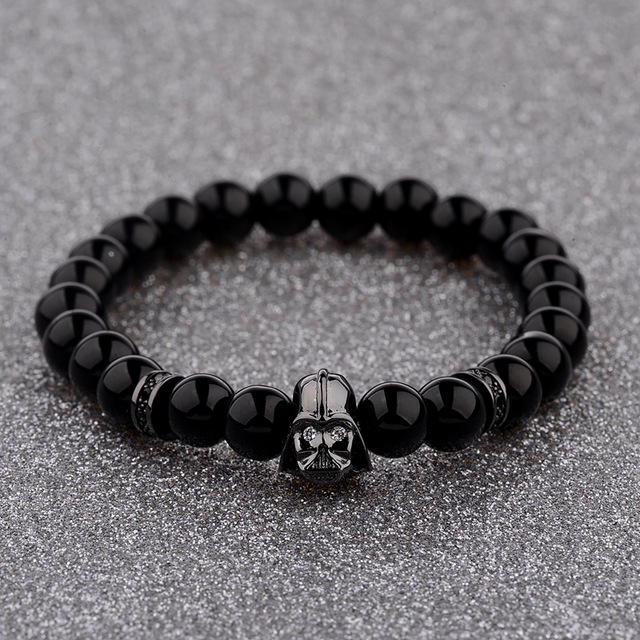
In her book, she explains exactly why these charms are so appealing. In fact, she goes into detail describing the innate beauty these charms bear. Just think about it, there are so many things about them for you to like. They jingle while you walk, they sparkle, they are pretty, and, people simply love coming in close and examining each little charm dangling from the bracelet.

But, the most incredible feature these bracelets have is their power to tell a story. Each and every charm can store your fondest memories. You can cover your bracelet in numerous little figures and souvenirs. You can get a matching charm for every big occasion. So, feel free to collect them and store them on your bracelet for years to come.

Truly, to wear a charm bracelet is to wear your story on your sleeve. And, while the most important piece of jewelry most women have is their wedding ring, charm bracelets take close second place. These bracelets are also excellent conversation pieces. In fact, it is not rare for women to talk to you about their own bracelets upon seeing yours.

After all, jewelry is one of the methods women advertise their status, their power, and social position. Jewelry offers you a way to flaunt, bedazzle, seduce, or woo. And, for all they are, charm bracelets are an incredible feminine autobiography around your wrist. They can express who you are in a subtle way.

You can customize your charm bracelet any way you want. You can use charms that are for travelers. There are also charms that are feminine, whimsical, funny, or even glamorous. They simply demand the attention of others and turn eyes wherever you are. In fact, when it comes to Tracey Zabar, it is that attention that convinced her to start creating her own bracelets. She would walk around in the middle of New York, and women would approach her to talk about her bracelet. And, not long after, she had many of them asking her to create bracelets for them too. She found out that there is an emotional goldmine she could start using to open her own store.

Featured

11 Facts About Magazines

Executives of five of the largest publishing companies in the world — Hearst Magazine, Meredith National Media, Time, Conde Nast and Wenner Media — compiled 11 compelling facts about the magazine publishing industry. While we live in a new age, the power of quality print publications is still in demand.

  1. Magazine readership has grown over the past five years. (Source: MRI)
  2. Average paid subscriptions reached nearly 300 million in 2009 (Source: MPA estimates based on ABC first and second half 2009 data)
  3. 4 out of 5 adults read magazines. (Source: MRI)
  4. Magazines deliver more ad impressions than TV or Web in half-hour period. (Source: McPheters & Company)
  5. Magazine readership in the 18 to 34 segment is growing. (Source: MRI)
  6. Since Facebook was founded, magazines gained more than one million young adult readers. (Source: MRI)
  7. The average reader spends 43 minutes reading each issue. (Source: MRI)
  8. Magazines are the No. 1 medium of engagement – across all dimensions measured. Simmons’ Multi-Media Engagement Study find magazines continue to score significantly higher than TV or the Internet in ad receptivity and all of the other engagement dimensions, including “trustworthy” and “inspirational.” (Source: Simmons Multi-Media Engagement Study)
  9. Magazines and magazine ads garner the most attention: BIGresearch studies show that when consumers read magazines they are much less likely to engage with other media or to take part in non-media activities compared to the users of TV, radio or the Internet. (Source: BIGresearch Simultaneous Media Usage Study)
  10. Magazines outperform other media in driving positive shifts in purchase consideration/intent. (Source: Dynamic Logic)
  11. Magazines rank No. 1 at influencing consumers to start a search online – higher than newer media options. (Source: BIGresearch Simultaneous Media Usage Study)

Featured

Where Have All the Music Magazines Gone?

When other writers and I get together, we sometimes mourn the state of music writing. Not its quality — the music section of any good indie bookstore offers proof of its vigor — but what seems like the reduced number of publications running longer music stories.

In the United States, music coverage now often comes in the form of “20 songs you need right now.” Websites offer features that masquerade as listicles detailing “10 reasons you should listen to so-and-so” or brief posts built around new singles, new videos, artistic feuds, and trending memes. Don’t get me wrong — I need music news, and I love a good list ranking ABBA’s 25 best songs, which is 23 more than I knew existed. I also love being whisked away in a story. Music is the thing that unites all people, and immersive music writing can provide as pleasurable an experience as an hour alone with your streaming service.

This isn’t a uncommon opinion: Many people I know enjoy reading and writing narratives about bands old and new. We love stories about memorable tours, obscure historical incidents, influential songs, personal obsessions, and overlooked music, like Julian Brimmers’s oral history of the short-lived genre Chipmunk Soul. We love career retrospectives and in-depth examinations of gender, race, culture, and our own identities as listeners; same for stories about lost albums, underappreciated musicians, and personalized political pieces like Ellen Willis’s “Beginning to See the Light,” an important dissection of feminism, fandom, and punk rock. These narratives aren’t pegged to a local show, or built around an upcoming album release or Super Bowl performance, which then highlights an increasingly relevant question: Without these news pegs, where do writers send them? For those of us who will likely never write for big slicks like The New Yorker or GQ, and who can’t just write books about the music we want, it’s very difficult to find nationally distributed magazines willing to publish unpegged longform music pieces. Many stories are important enough for us to try to tell, but American newsstands are now practically devoid of music magazines. Where did they go? Assessing the state of music writing requires a look at recent history, which can easily seduce you into discouraging nostalgia.

***

American music journalism started in the 1960s at the Village Voice and Crawdaddy but quickly became so popular that, in 1968, The New Yorker hired Ellen Willis as its first pop music critic. The decade saw an explosion in the genre’s exploration, thriving at newly established titles like Rolling Stone, Creem, Bomp!, and Cheetah, a proliferation which continued well into the 1970s. By the 1980s, it crossed from outlets like the original Bitch: The Woman’s Rock Mag with Bite into the mainstream at Spin, Hullabaloo, The Face, Right On!, MTV, and Black Beat, and at Option, Chunklet, Ray Gun, BAM, and The Rocket in the ’90s. While Rolling Stone first began in the attic of a printing press, nearly going bankrupt within its initial five years, music journalism proved to be extremely profitable.

You didn’t have to search long to find the zine-like Maximumrocknroll and Punk Planet, both as punk in their editorial independence as their musical tastes. If you went to Tower Records, you could pick up their free magazine Pulse!. Even the skate mag Thrasher published band profiles and music news. (One 1989 issue reported: “Rumor from Texas tells of a New Kids on the Block gig gone awry when Kerry King of Slayer threw beer on the New Kids’ lead singer. Kerry and Kid then proceeded to beat each other up while security held the other New Kids back.”) The Source and Vibe were the rap scene’s ultimate taste arbiters, and artists featured in The Source’s “Unsigned Hype” column often became some of the generation’s leading hitmakers, from Notorious BIG to Big Pun and DMX. But hip-hop magazines also featured those bubbling in the underground, rappers that received acclaim in Rap Pages, Stress, Straight No Chaser, and The Bomb Hip-Hop Magazine.

We can’t forget the Beastie Boys’ eclectic six-issue run with Grand Royal, and of course, all the fan zines across the decades, from Flipside and Forced Exposure to Chemical Imbalance. To me, this list of titles shows an unwavering appreciation for music news and stories. As one of Tower Records’ old slogans put it: “No Music, No Life.”

In hindsight, the 1990s and early aughts now resemble the salad days of traditional magazine publishing. It was a time when a writer like Ann Powers could reasonably hope to work as a pop music critic at the Los Angeles Times, and hip-hop journalists could launch their own print magazines like Sacha Jenkins’s ego trip. Da Capo Press’ beloved Best Music Writing anthology was an annual mainstay, and chain bookstores everywhere from Manhattan to Bakersfield stocked a wealth of glossy titles. Spin, Blender, Harp, Magnet, Paste, FILTER, The Big Takeover, Under the Radar, Alternative Press, and Rolling Stone covered rock and pop. The Source, Vibe, Wax Poetics, The Fader, Mass Appeal, XXL, and URB covered hip-hop, soul, jazz, electronic, and R&B. Decibel did metal. Relix did live, improvisational music, No Depression roots music, and Down Beat and JazzTimes sat alongside British stalwarts The Wire and NME.

Hell, there was even a magazine called Ferret Fancy ─ which I read! It had nothing to do with music, but its niche focus embodied these vibrant times. The quality of stories wasn’t universally high, but at least these titles formed a diverse journalistic ecosystem. Alt-weeklies like Chicago Reader, Washington City Paper, and Minnesota City Pages didn’t limit themselves to short criticism or Q&As, and they continued to publish solid music stories, while The Believer loved music so much it eventually launched an annual music issue, following the Oxford American’s lead, which had been publishing music issues with CDs since its 16th issue in 1997. The OA itself followed the lead of CMJ New Music Monthly, which was the first print pub to include a free CD. Stories from many of these publications got reprinted or noted in Best Music Writing.

And though mainstream general interest magazines like Vanity Fair and Esquire, equipped with a greater reach than music magazines, often published what seemed like PR pieces disguised as profiles, they could also surprise you. Vanity Fair contributor David Kamp wrote vividly about L.A.’s infamous Whisky A-Go-Go in 2000. Elizabeth Gilbert profiled Tom Waits for GQ in 2002. For Vibe, Karen R. Good wrote about groupies, materialism, and misogyny in hip-hop in 1999. Mary Gaitskill wrote about her complex attraction to sexist Axl Rose for Details back in 1992. I had barely learned how to pitch magazine stories by 2007, yet it was a glorious time to read and write about music. Then the 2008 recession hit.

You know the details: Residential construction ground to a halt. Manufacturing jobs got cut. Wall Street spiraled into chaos, and Main Street footed the bill. Amid the financial carnage, magazine advertising revenues plummeted. Total ad pages dropped from 255,667 in 2007 to 172,240 by 2010. Magazine newsstand sales had been declining before the recession, but magazines’ advertising revenues precipitously fell from $13.9 billion in 2008 to $10 billion in 2009, in part because online ad revenue kept cutting into print revenue — 31 percent from 22.3 million in 2002 to 15.4 million in 2008. Ad sales in U.S. national magazines fell over 20 percent compared to the previous year during the first quarter of 2009 alone. When advertising shrunk, magazine budgets shrunk. Once reliable publications like Rolling Stone cut back their page numbers, not to mention dimensions. Others like Harp and Blender flat out died. To streamline operations, magazines restructured sales departments and reduced print schedules and staff. Vibe briefly shuttered in 2009, then resumed publishing just six issues a year. Others, like URB, converted from a print to an online magazine. Paste traded print for web in 2010 in an effort to stave off its demise, but only after first installing a failed pay-what-you-wish subscription system modeled after the one Radiohead used for its 2007 album In Rainbows. Spin stayed with its print model until 2012, the year Spin Media’s new CEO laid off 11 editorial staffers and reframed the magazine as “a media company with a print property,” further distancing themselves from print journalism. When the recession’s dust settled, after a period of almost two years, newsstands looked very different, and that’s largely how they’ve remained.

Magazines rise and fall. They lose relevance, their founders move on, or get revamped or shut down by new owners. Some speak for their generation, then the next generation finds a way to speak for themselves. The internet has shaped how current generations speak about music.

***

Before the internet, when people bought records, tapes, and CDs, they found new music from professional music critics, record store clerks, MTV, and word of mouth. This meant that record labels needed magazines to advertise their newest offerings. Labels hung big promotional posters in record stores, and chains like Tower and Virgin had sizeable magazines racks. As music critic Simon Reynolds described that era: “All music and most information were things you literally got your hands on: they came only an analogue form, as tangible objects like records or magazines.” If you wanted to discover records by the loud scuzzy garage bands that mainstream media ignored, like Nights and Days, you read a zine like Jay Hinman’s Superdope. If you wanted to know if the mainstream albums that just came out were good, you read Option, which ran hundreds of reviews. One 1988 issue I have contains 37 pages of album reviews, five pages dedicated to cassette reviews, and a six-page ad from SST records! “The net destroyed the model,” editor Jack Rabid told me via email.